GAPONE — omni-channel marketing automation
GAPONE is GAPIT's marketing-automation SaaS: letting 1,000+ SMEs run omni-channel messaging, segmentation, campaigns, loyalty programs, mini-games and chatbots from a single dashboard. I designed the platform UI and the system behind it.
- Role
- UI/UX · Design System
- Timeline
- 2024
- Team
- GAPIT Communications
- Scope
- Platform UI + component system + client demos
GAPONE had been live for nearly a year on a poor outsourced design: inconsistent patterns drove 68% user confusion, and 80% of customers found segmentation so complex that sales had to run it on their behalf. There were no business requirements, specs or design guidelines to build on. It had to unify scattered messaging, segmentation and campaign tools into one coherent, approachable product for non-technical marketers, on a design system that could ship features and tailored client demos fast.
- 01
Define
Unified scattered marketing capabilities into one coherent product.
- 02
Systemise
Built the component system that powers features and client demos.
- 03
Design
Designed the dashboard, segmentation, campaign, loyalty and chatbot flows.
A year live, and no spec to stand on
The platform had been live for nearly a year on an outsourced design nobody could defend: 68% of users reported confusion, and there wasn't a single requirements doc, spec or guideline to rebuild from. So the rebuild started with structure, not screens: reverse-mapping what the product actually did, then regrouping it into task areas that match how an SME marketer thinks (segmentation, campaigns, loyalty, mini-games, chatbot) one sidebar, one dashboard, one mental model instead of a pile of tools.
If sales has to drive it, design has failed
Segmentation was the feature customers paid for and couldn't use, 80% found it so complex that sales staff ended up running it on their behalf. The redesign turned the logic itself into the interface: a tree structure where conditions are dragged into place and AND/OR relationships read like a sentence, not a query. Beginners start from templates; power users chain conditional logic as deep as they need. The same principle carried into the chatbot builder, a node-based visual canvas instead of configuration forms.
Onboarding stops blocking the door
Onboarding was where the product lost people before it could prove anything: twelve steps, and 54% never finished. The rebuilt flow asks only what it takes to get a marketer to their first working campaign: five steps, 87% completion, 72% faster. It's the cheapest kind of win: nothing new was added, the product just stopped standing in its own doorway. Downstream, the numbers moved with it: conversion climbed from 23% to 47% and average sessions stretched from 2.7 to 6.4 minutes, because people finally reached the parts worth staying for.
A design system that sells
With no guidelines to inherit, the component library was built to be the product's second engine. It cut development time by 42% and UI inconsistencies by 68%, but its sharpest use was commercial: when sales needed a demo tailored to a specific client, it could be assembled quickly from real components, showing prospects their own brand running on GAPONE. The same system carried the platform to full mobile feature parity, from 40% to 100%, lifting mobile usage 58%, and later underpinned a Zalo Mini App serving 300+ SMBs.
One product, not a toolbox.
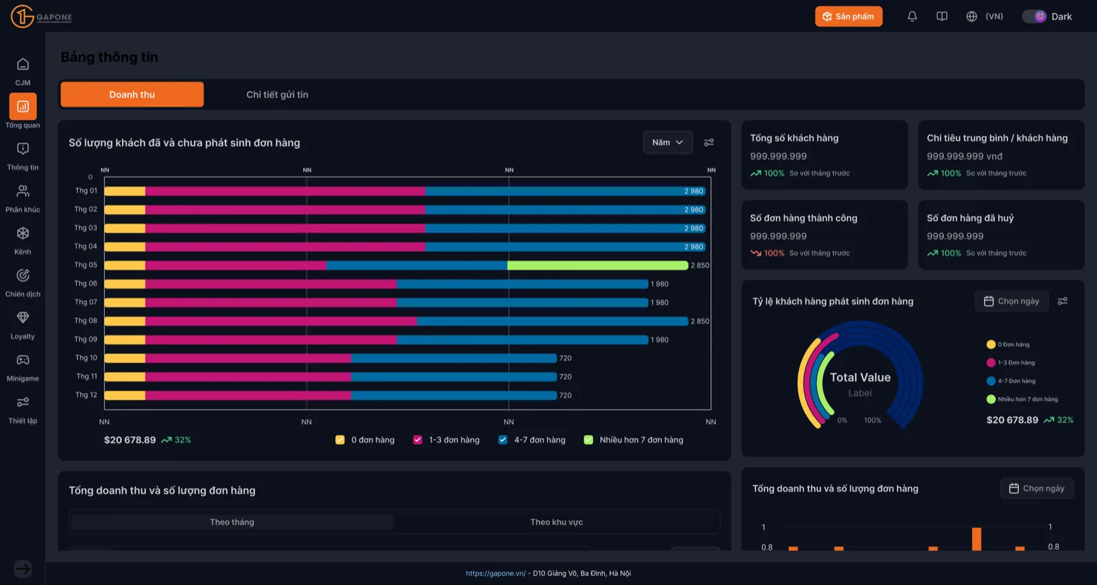
One dashboard, many channels
Unifying omni-channel into a single surface made a sprawling toolset feel like one product.
A system for fast demos
The component system let us spin up tailored client demos quickly, design directly helping sales.
- ✦Conversion 23% → 47%; average session 2.7 → 6.4 min
- ✦Onboarding rebuilt: 12 steps (54% drop-off) → 5 steps (87% completion), 72% faster
- ✦Mobile feature parity 40% → 100%, lifting mobile usage +58%
- ✦Omni-channel messaging became the #2 revenue driver (25% of new MRR)
- ✦NPS/CSAT 6.8 → 8.4; LTV +35%; churn 8.5% → 5.2%; retention +42%, tickets −35%
- ✦Design system cut development time 42% and UI inconsistencies 68%
- ✦Powered a Zalo Mini App for 300+ SMBs
Marketing tools win when they feel like one product, not a toolbox. The design system turned both features and sales demos into a fast, consistent pipeline: design that moved revenue, not just pixels.