
Astra Vision's corporate site tells the company story ('Future commerce meets AI') and frames its products (APEX, FECT, Korea–Vietnam solutions) for prospective enterprise customers.
- Role
- UI/UX · Front-End
- Timeline
- 2025
- Team
- Astra Technology
- Scope
- Marketing site — design & front-end
The company needed a credible, modern presence that explained a fairly technical AI-trade offering simply, for a Vietnamese export audience.
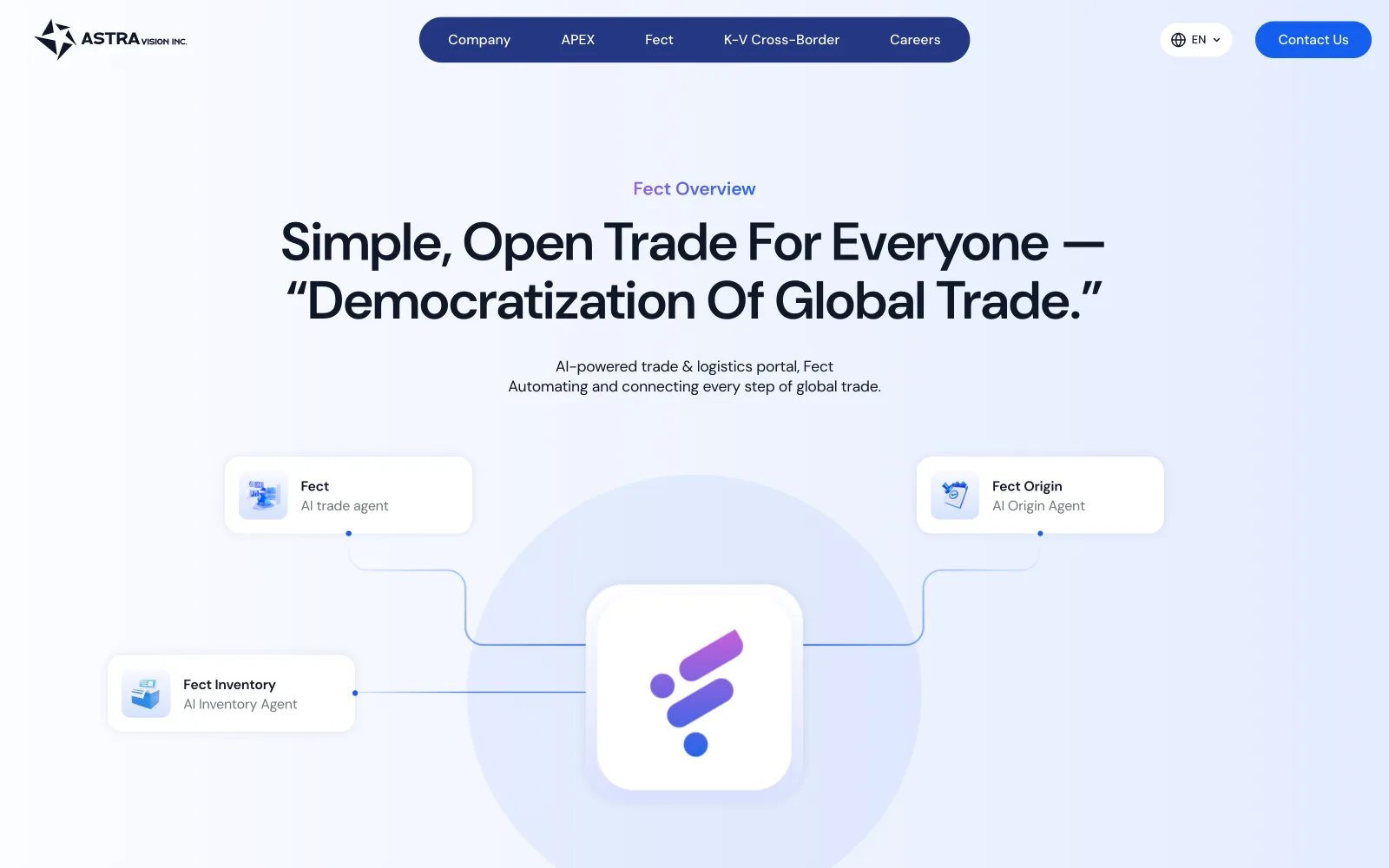
- 01
Define the story
Distilled a technical AI-trade offering into one clear promise: 'Future commerce meets AI'.
- 02
Structure
Built the information architecture so APEX, FECT and the Korea–Vietnam solutions each get their moment.
- 03
Design & build
Designed a modern, credible UI and shipped the front-end at astratech.vn.
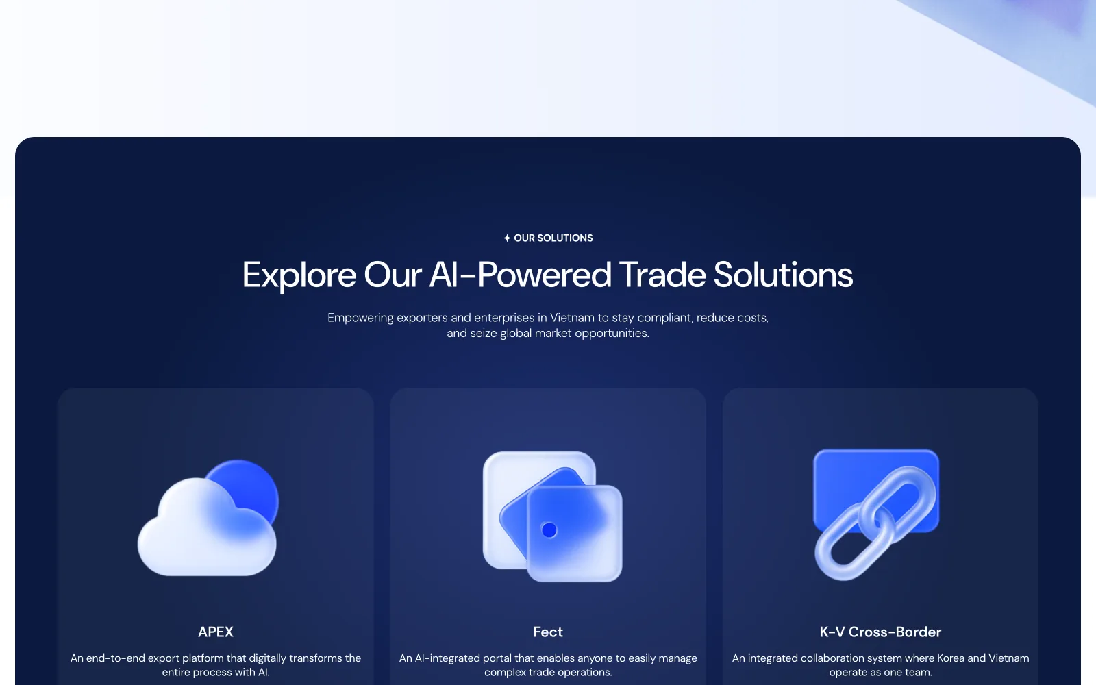
Three products, one shelf
A corporate site for a product company has one real job: make the family legible. The navy solutions panel puts APEX, Fect and K-V Cross-Border on one shelf as three 3D-icon cards (same card anatomy, one accent each) so a partner understands the portfolio in a single viewport. Every product page then inherits this grammar, which is why the whole site feels like one company rather than three brochures stapled together.
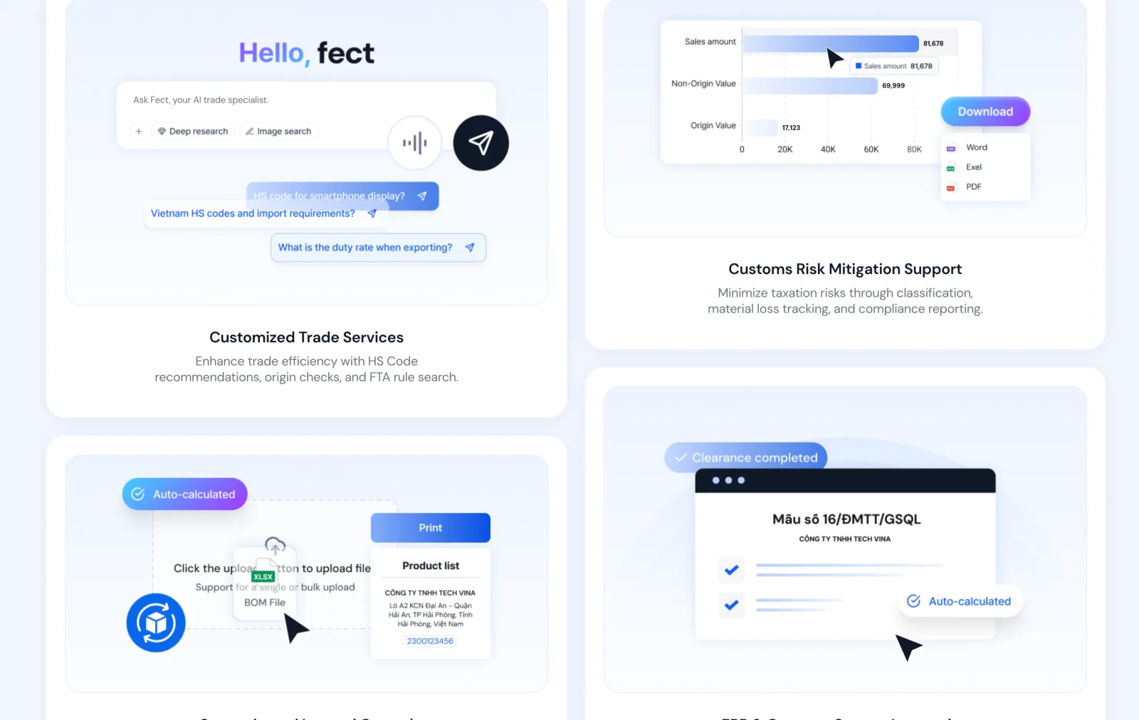
Corporate pages with real UI inside
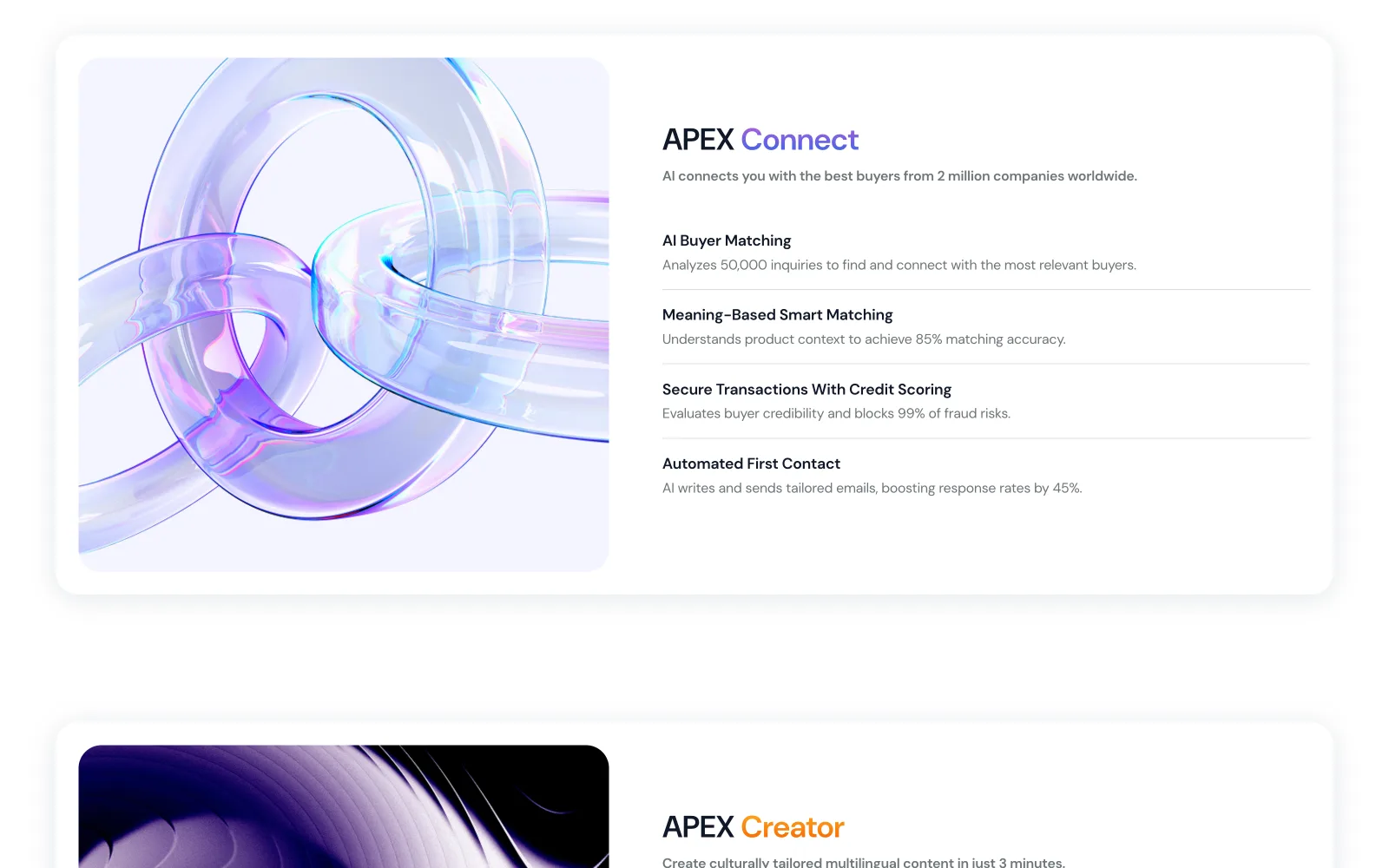
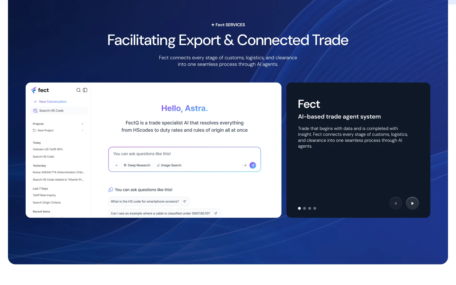
Most corporate sites hide products behind adjectives. Here the 'Hello, fect' section drops four real product frames into the page: the AI chat, an export chart, a BOM upload, an auto-calculated customs declaration. Screenshots are commitments: they promise a UI that actually exists. For a company selling software to sceptical trade teams, that's worth more than any tagline.
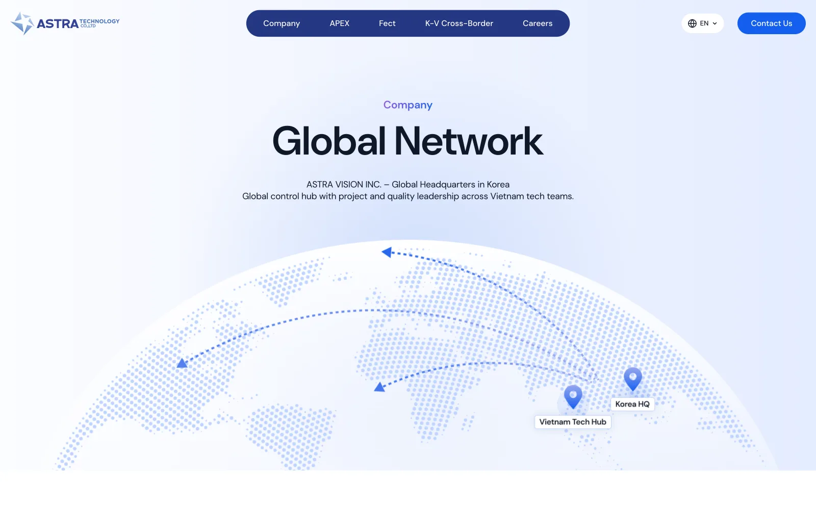
Korea HQ, Vietnam Tech Hub — drawn honestly
The Global Network page could have been a vanity world map with twenty fake pins. It shows exactly two: Korea HQ and the Vietnam Tech Hub, on a dotted hemisphere. For a young company, honesty scales better than inflation. Two real pins invite the question 'what do you do across those two?', which is precisely the conversation Astra wants to have.
The prism fits in a pocket
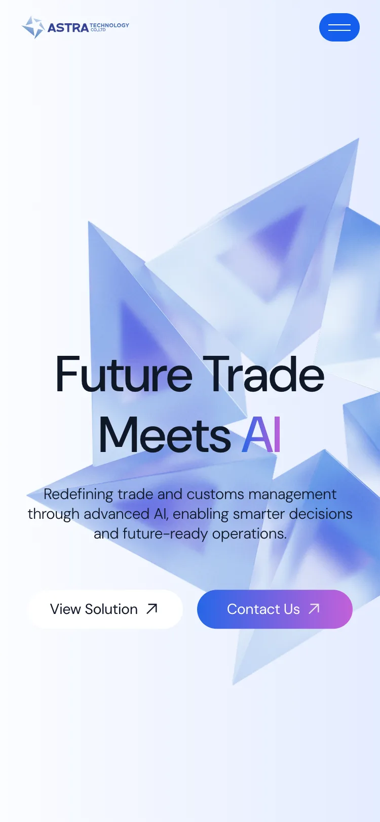
On mobile the hero keeps its full sentence and its prism: scaled, not amputated. Partners open links from messengers on phones far more often than from a desk; the first impression had to survive 375px with the composition intact: type first, glass object anchoring the corner, one thumb-reachable CTA.
English for partners, tiếng Việt for home
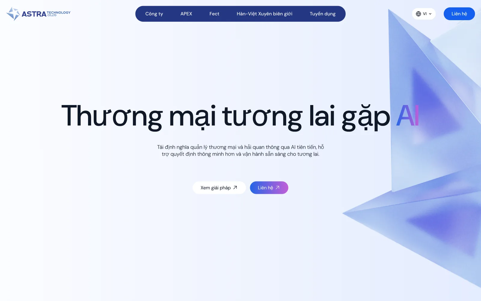
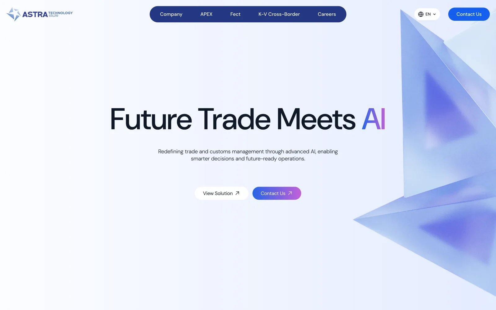
Astra sells to Korean partners and hires in Vietnam: the corporate site speaks both, from one layout. The hero survives the swap because it was designed for the longer string first: Vietnamese diacritics get their line-height, English gets its tighter rhythm, and the prism keeps the composition anchored either way. Drag to compare.
Corporate hero · drag the divider

Show the product. Skip the adjectives.
Lead with the promise, not the jargon
Enterprise visitors meet a simple value statement first; the technical depth comes later, on their terms.
 01 / 0502 / 05
 03 / 05
 04 / 0505 / 05
- ✦A live company site that clearly positions Astra Vision and its product family.
The hardest part of a company site is restraint. Saying what an AI-trade platform actually does in one breath. Leading with the promise and letting the product family unfold below kept it credible without burying visitors in jargon.