Apollo 2.0 — national R&D platform (KISTI)
Apollo 2.0 is South Korea's national R&D technology-connection platform, delivered for KISTI (Korea Institute of Science & Technology Information), including views like the 'promising commercialisation' public-R&D forecast. Beyond the screens, I built the admin design system behind it: a full component library so a data-heavy government platform stays consistent and fast to extend.
- Role
- UI/UX Designer · Design System
- Timeline
- 2024
- Team
- Astra Technology — for KISTI (government)
- Scope
- IA, high-fidelity UI & the admin design system
Apollo connects two sides that rarely speak the same language: public R&D labs with technology to license, and businesses hunting for the right innovation. As a government-authorised platform centralising national R&D, it had to hold 30,000+ technologies and dense analytics, yet stay scannable for expert users and credible to government stakeholders. The hard part wasn't search. It was matchmaking.
- 01
Plan
Scoped the platform with the KISTI team and agreed what 'connection' meant in practice.
- 02
Architect
Built the information architecture to make heavy research data quick to scan.
- 03
Design
Delivered high-fidelity UI tuned for expert users.
A national database that opens with a question
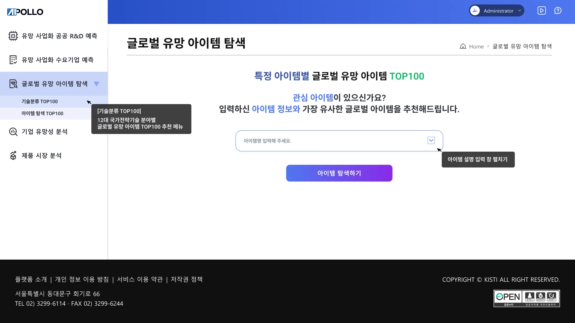
Apollo holds 30,000+ public R&D technologies, and the obvious design is a search bar on top of a database. But the brief was never search. It was matchmaking between labs that have technology and businesses that need it. So the explore screen opens like a conversation: name the item you care about, and the platform recommends the closest global items, with inline tooltips walking a first-time user through what each menu actually forecasts. A search engine assumes you know what to look for; a matchmaker only asks what you have. That reframing is what pushed successful connections up 65%.
One page that reads like a briefing, not a dump
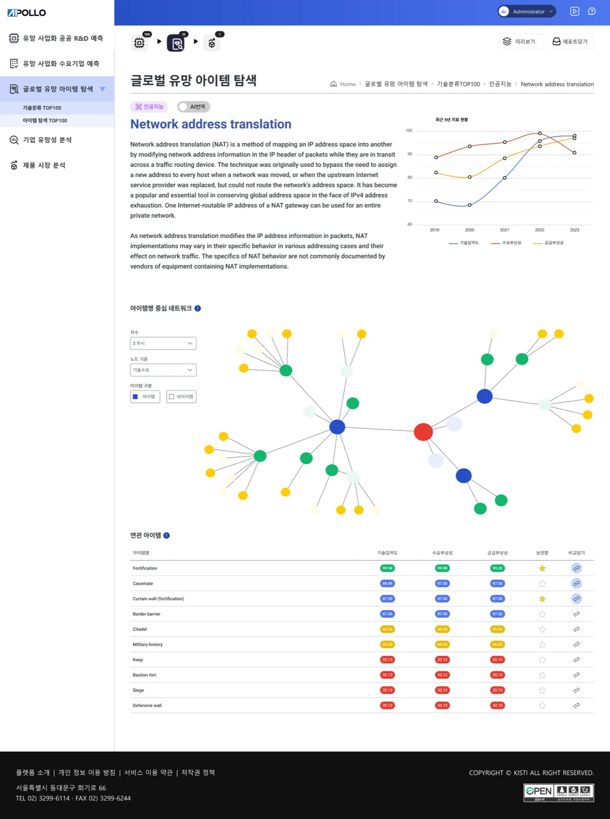
A single item page carries a plain-language description, a five-year indicator trend, an item-centred network graph and a related-items table, the kind of load that usually collapses into clutter. The rule was density with breathing room, sequenced the way an analyst thinks: read what it is, see where it's heading, see what it connects to, then compare the neighbours. Scores wear colour-graded chips so a 99 and a 32 register before you've read the digits, and bookmark-and-compare sits on every row because reading was never the end goal. Density, here, is respect for the expert reader.
A score means nothing until it stands next to something
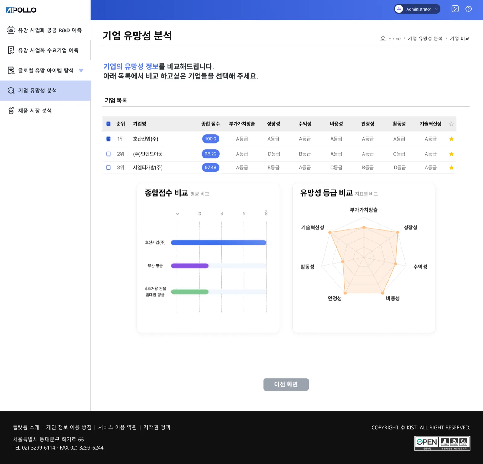
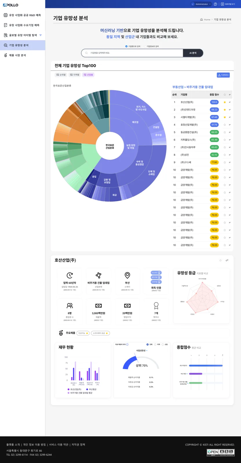
Corporate Prospect Analysis rates thousands of companies, but a raw score doesn't help anyone decide. So every number ships with its context: a sunburst slices the Top 100 by Korea's industrial classification, letter grades turn seven metrics into a report card you can scan down a table, and each company card sets its bars against the regional and industry averages, with a radar showing the shape of its strengths. The same Highcharts language runs through all of it. The design bet: experts don't want the system's answer. They want the evidence arranged so their own answer comes fast.
Government platforms outlive their designers
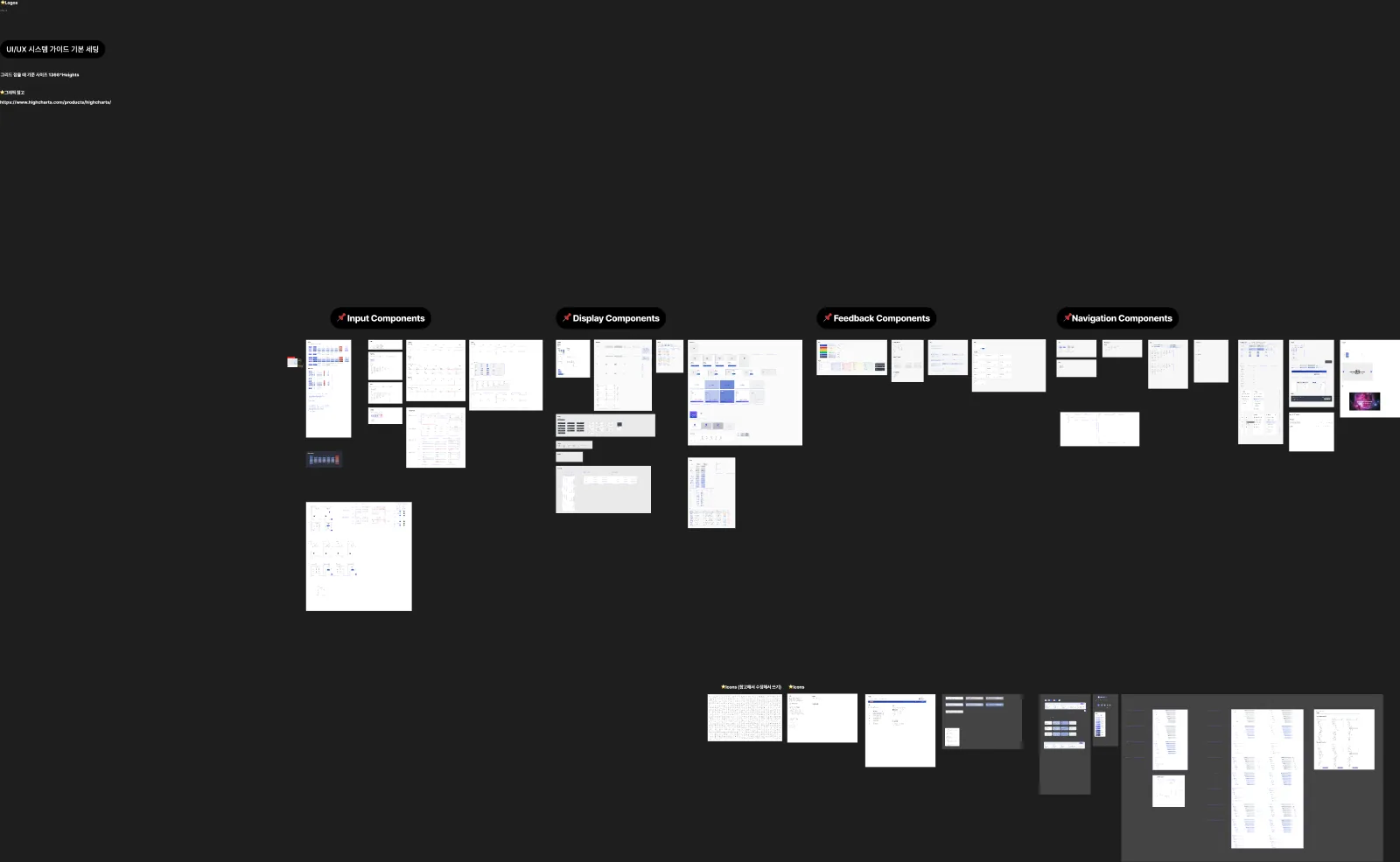
The screens are the visible half; the Apollo Admin design system is the half that keeps them honest. I organised it into four pinned families (Input, Display, Feedback, Navigation) plus an icon set and Highcharts-based data viz, with the table spec drawn down to every cell variant, status chip and header state. On a data-heavy platform a table isn't one component, it's the product, so it earned the deepest page in the library. The point of the system is time: screen forty has to look like it was designed on the same day as screen four, even when it's built years later by someone else.
Not a search engine — a matchmaker.
Density with breathing room
Expert users want to see a lot at once, the layout shows depth without tipping into clutter.
01 / 0502 / 0503 / 0504 / 05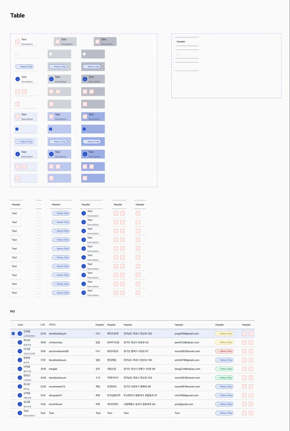 05 / 05
- ✦65% increase in successful technology connections
- ✦92% satisfaction among government stakeholders
- ✦30,000+ technologies actively maintained
- ✦Recognised as a cornerstone of South Korea's innovation infrastructure
Designing at national scale taught me to respect density without fearing it: expert users want to see a lot, fast. The real win wasn't a prettier screen; it was turning plain search into guided matchmaking, which is what actually moved successful connections up 65%.