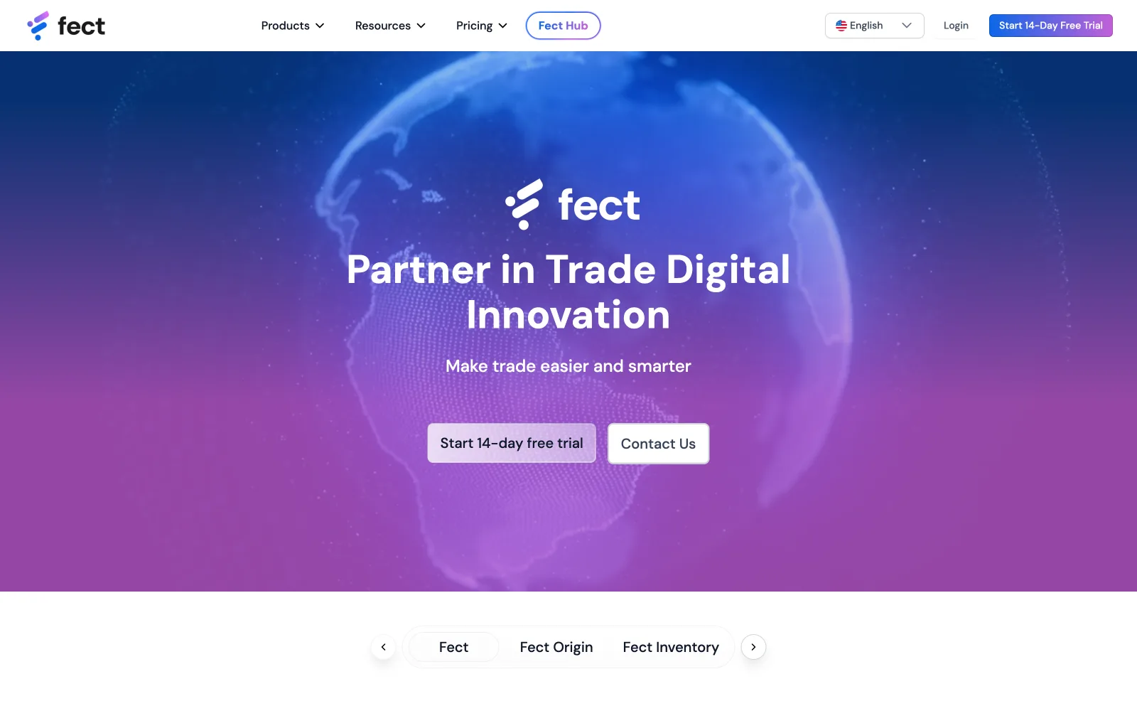
FECT — AI customs & trade portal
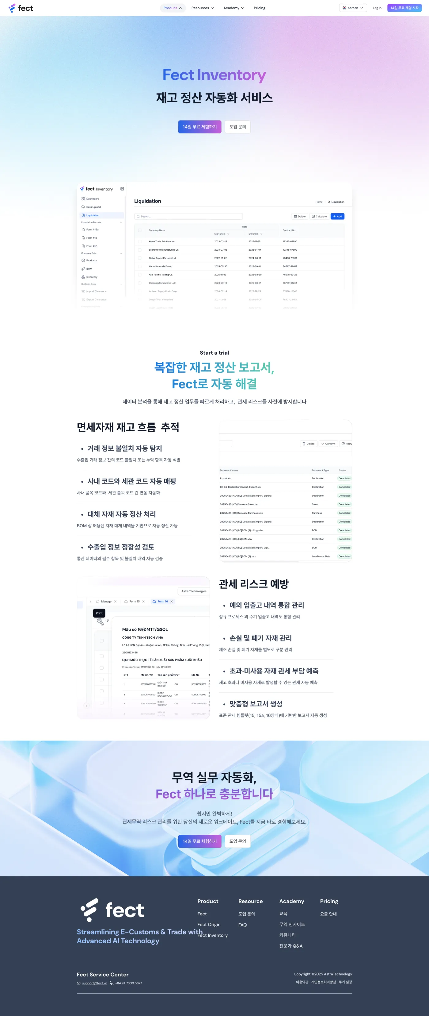
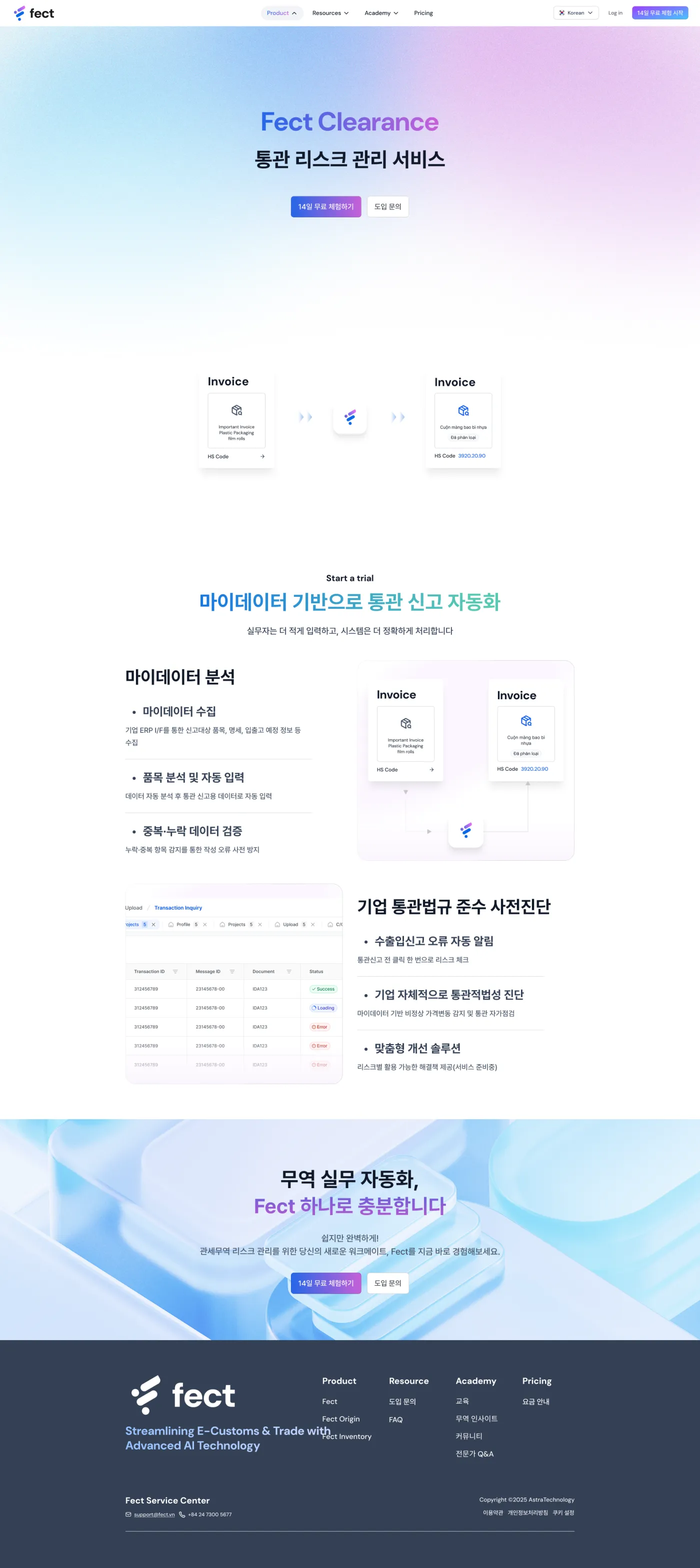
FECT is the flagship product of Rudasoft (now Astra Technology), an AI-integrated portal for cross-border trade that brings customs operations into one place for 500+ import-export enterprises. At its heart is an AI trade consultant that handles everything from HS-code and tariff lookups to rules-of-origin and legal questions, wrapped around six modules: Q&A, Origin, Inventory, Clearance, Track and Express.
- Role
- UI/UX Designer — covering product, content & motion solo
- Timeline
- 4-week landing sprint · design lead 2024 — Present
- Team
- Solo design · VN dev team · Korean BOD
- Scope
- Marketing portal + FectQ AI chatbot + design system
By August 2024 the FECT product worked (500+ enterprise users) but its landing didn't. A generic page converted at just 3.2%, bounced 68% of visitors and held attention for 23 seconds. With a Series A raise and a Vietnam expansion ahead, the company needed a marketing portal that told the story and qualified leads, with a brand-new AI chatbot, FectQ, built in. The catch: four weeks, zero marketing / pricing / feature documentation, and a Korean board referencing a dozen unrelated sites with no settled direction, and no PM, BA, marketing or motion designer to lean on.
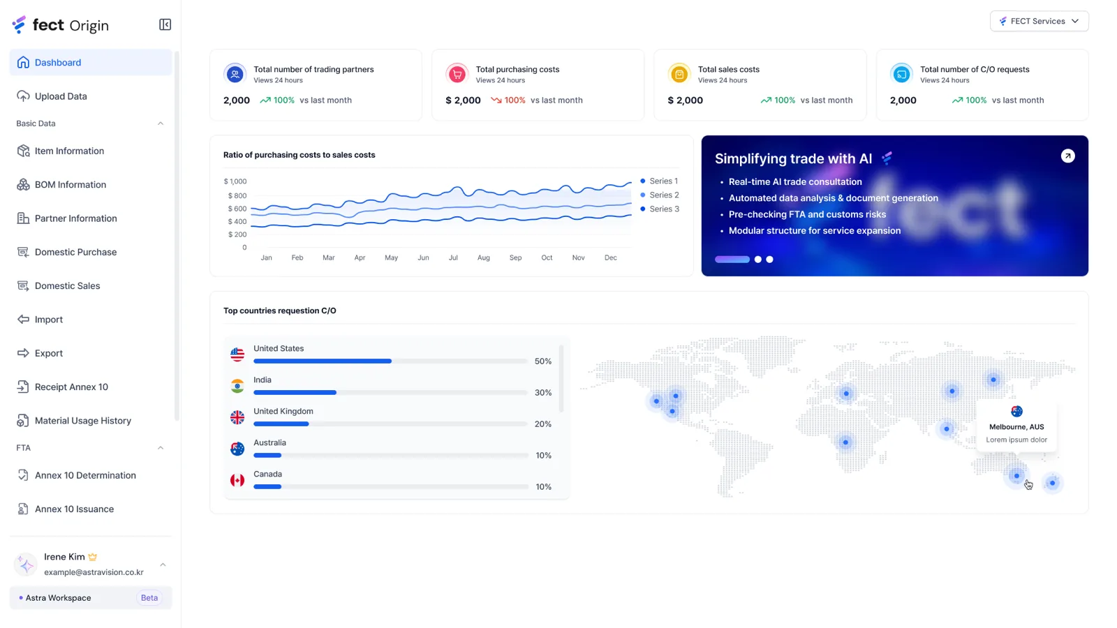
$500K+ ARR · 500+ enterprises · live
- 01
Discover
Shadowed how exporters actually file customs (interviews, support logs and behaviour data) to find exactly where shipments stall.
- 02
Define
Reframed six scattered modules into one coherent product and set the KPI framework that would judge every decision.
- 03
Systemise
Built the tokenised design system so the Portal, Admin and CO flows all spoke one visual language.
- 04
Design & build
Designed the high-fidelity flows, then built and shipped the Portal front-end live at fect.vn.
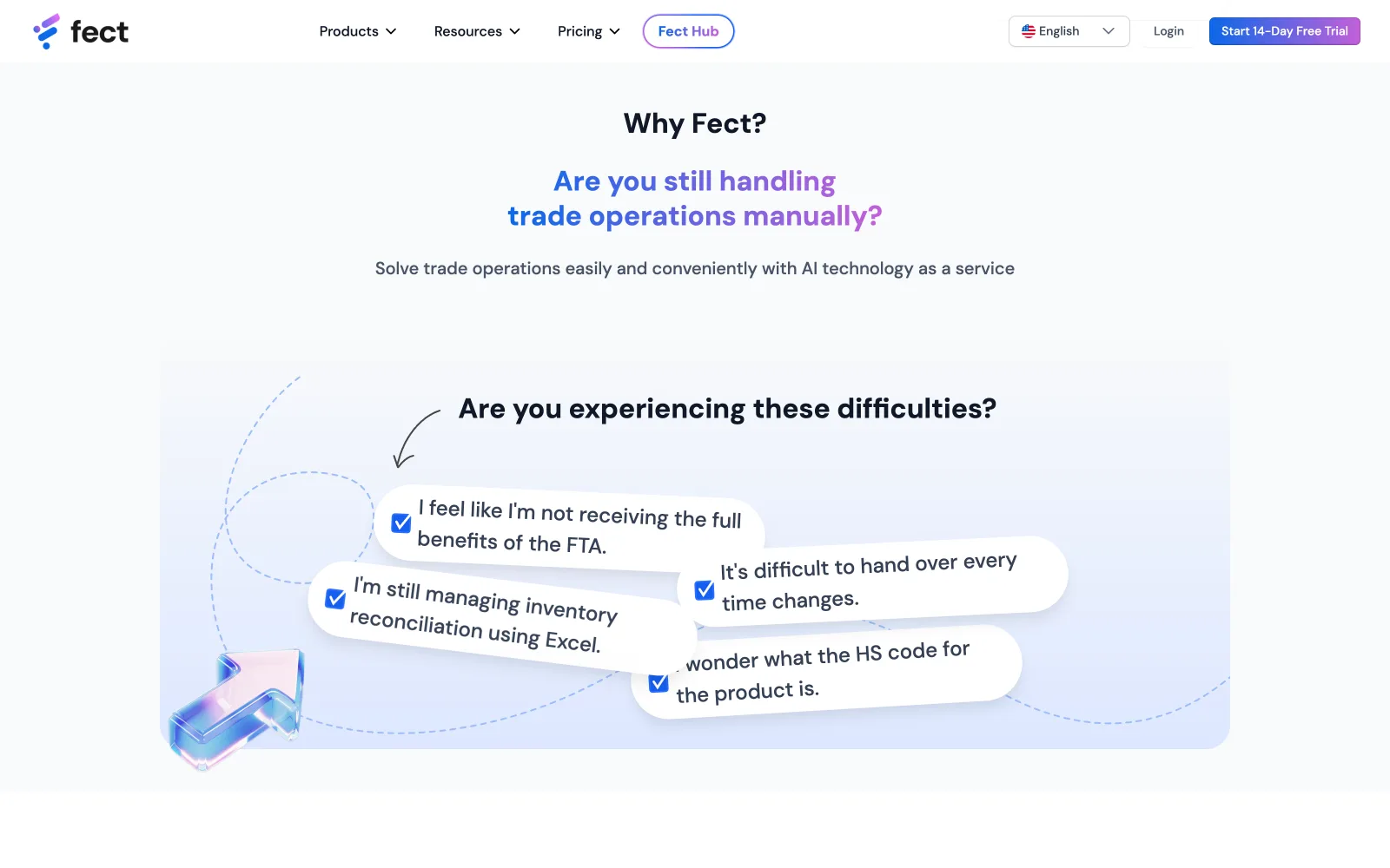
A working product, a failing front door
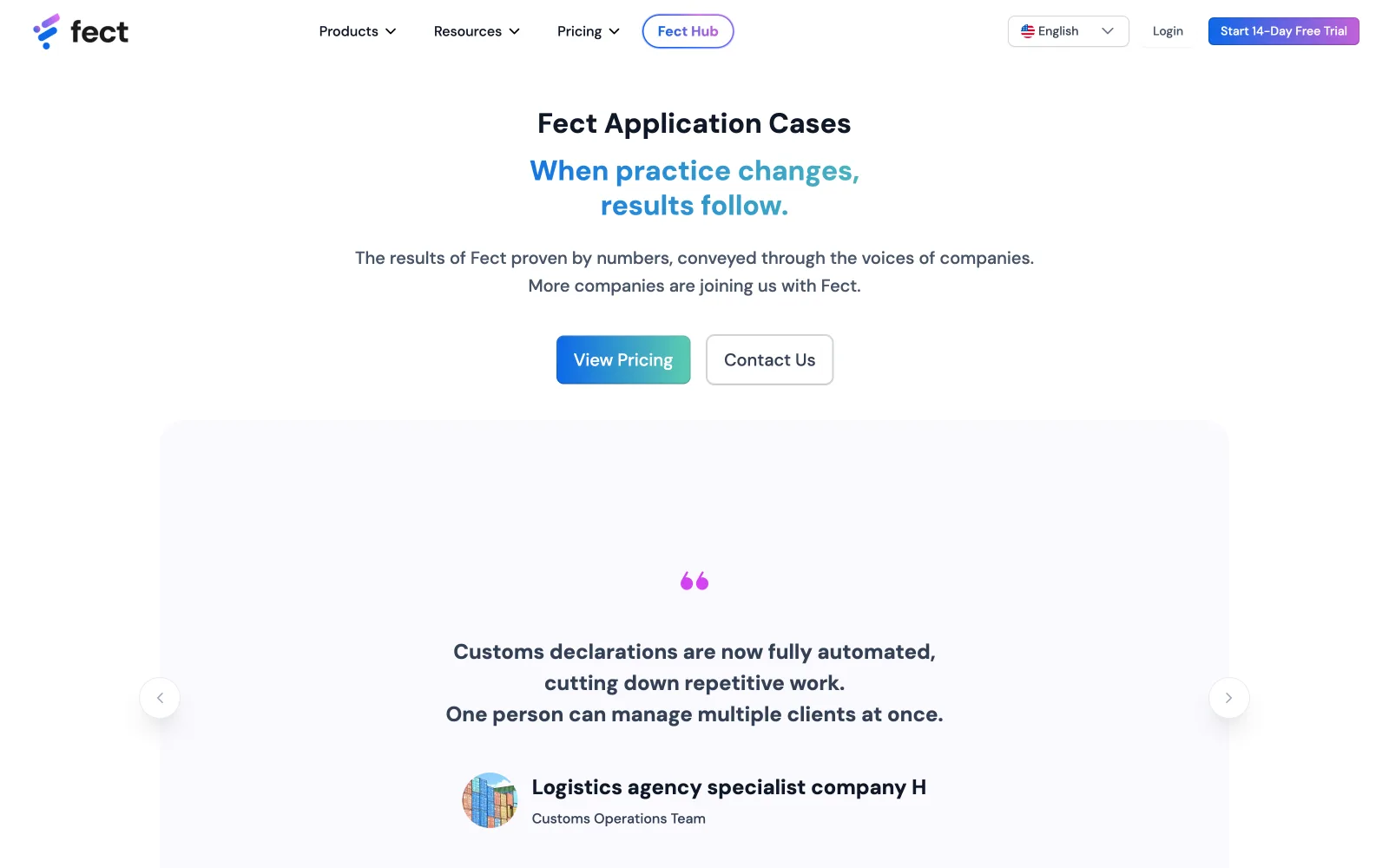
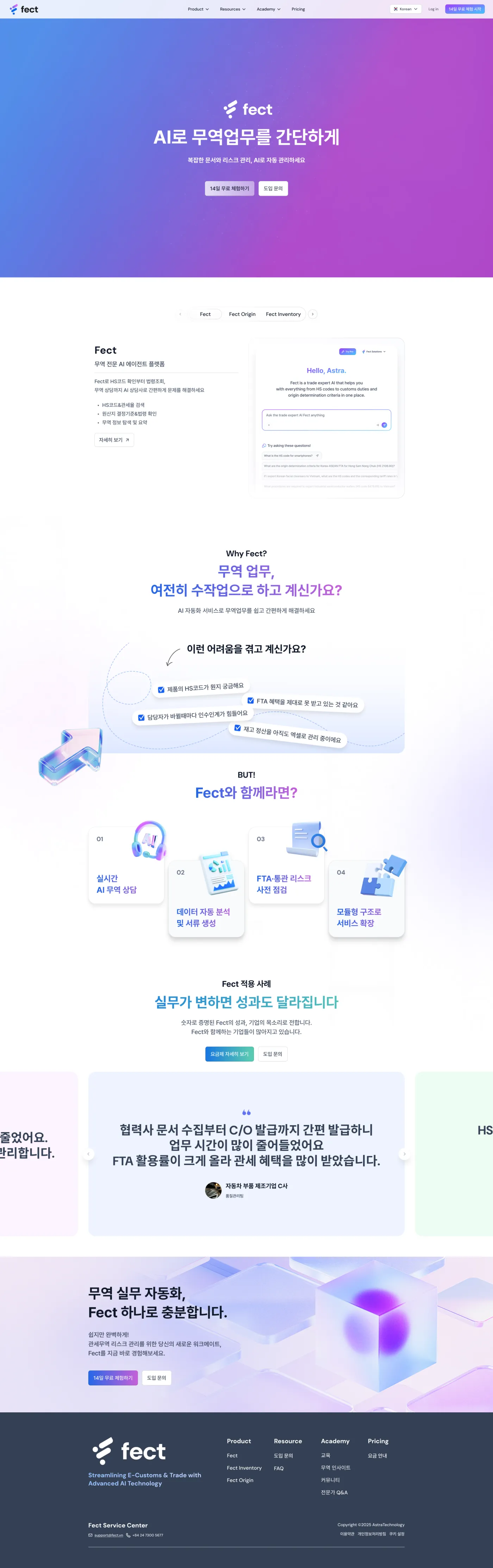
The product had 500+ enterprise users; the landing converted at 3.2%, bounced 68% of visitors and held attention for 23 seconds. The rebuild starts where the users hurt: a wall of real pain (FTA paperwork, Excel rituals, HS-code anxiety) written as speech bubbles in the trader's own voice, so a visitor's first scroll is recognition, not feature lists. Only after the nod comes the pitch.
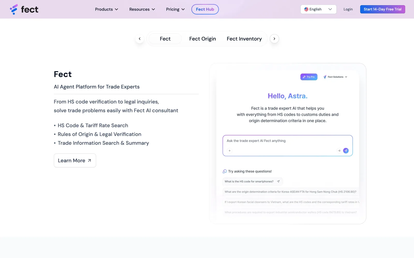
Put the AI where the doubt is
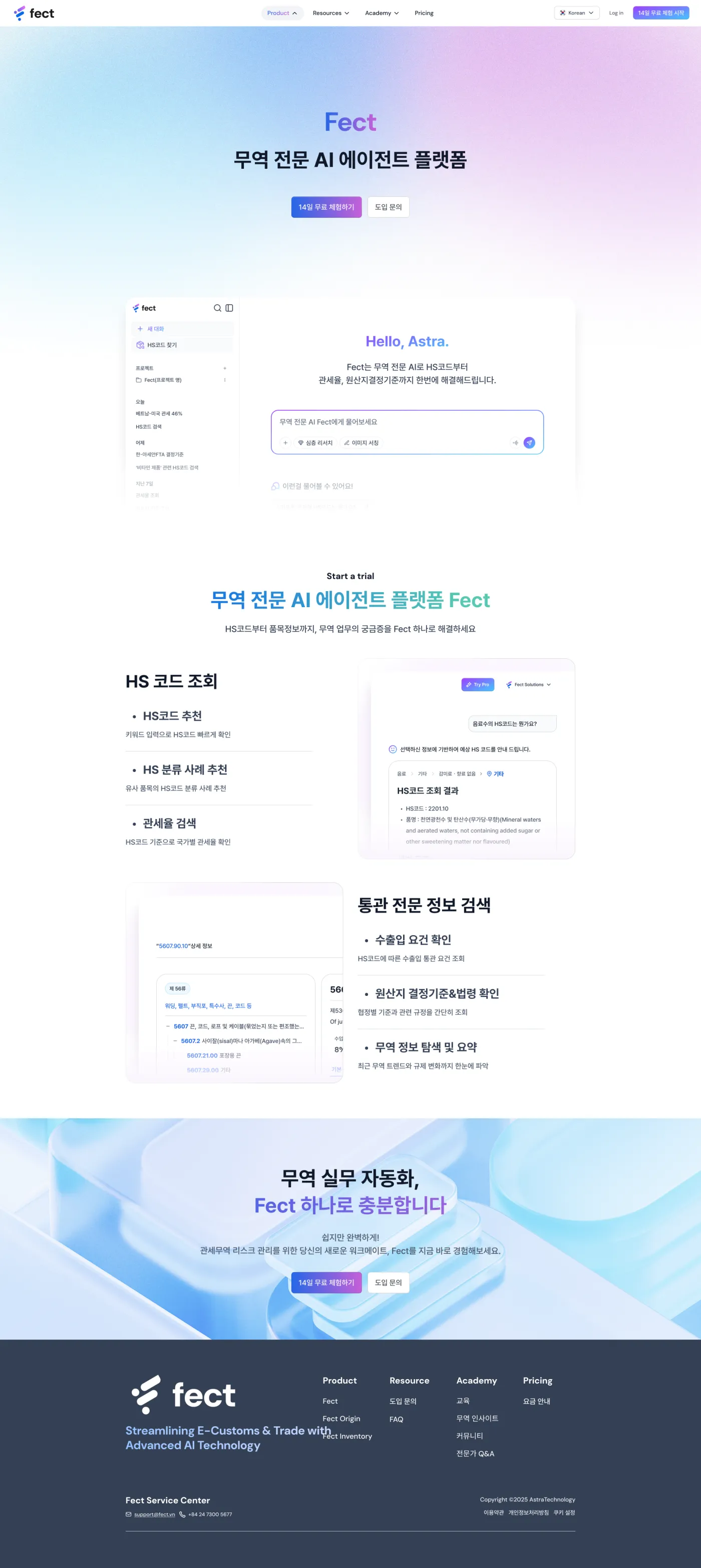
An 'AI trade consultant' is an abstract promise, so the section shows the consultation itself: a live-looking chat with the exact questions a trade team would ask (HS codes, FTA rates, origin rules) as one-tap suggested prompts. The mock is honest about what the product does, and the suggested questions double as an education layer: they teach a first-time visitor what an AI agent for customs even means.
Enterprise pricing, self-service confidence
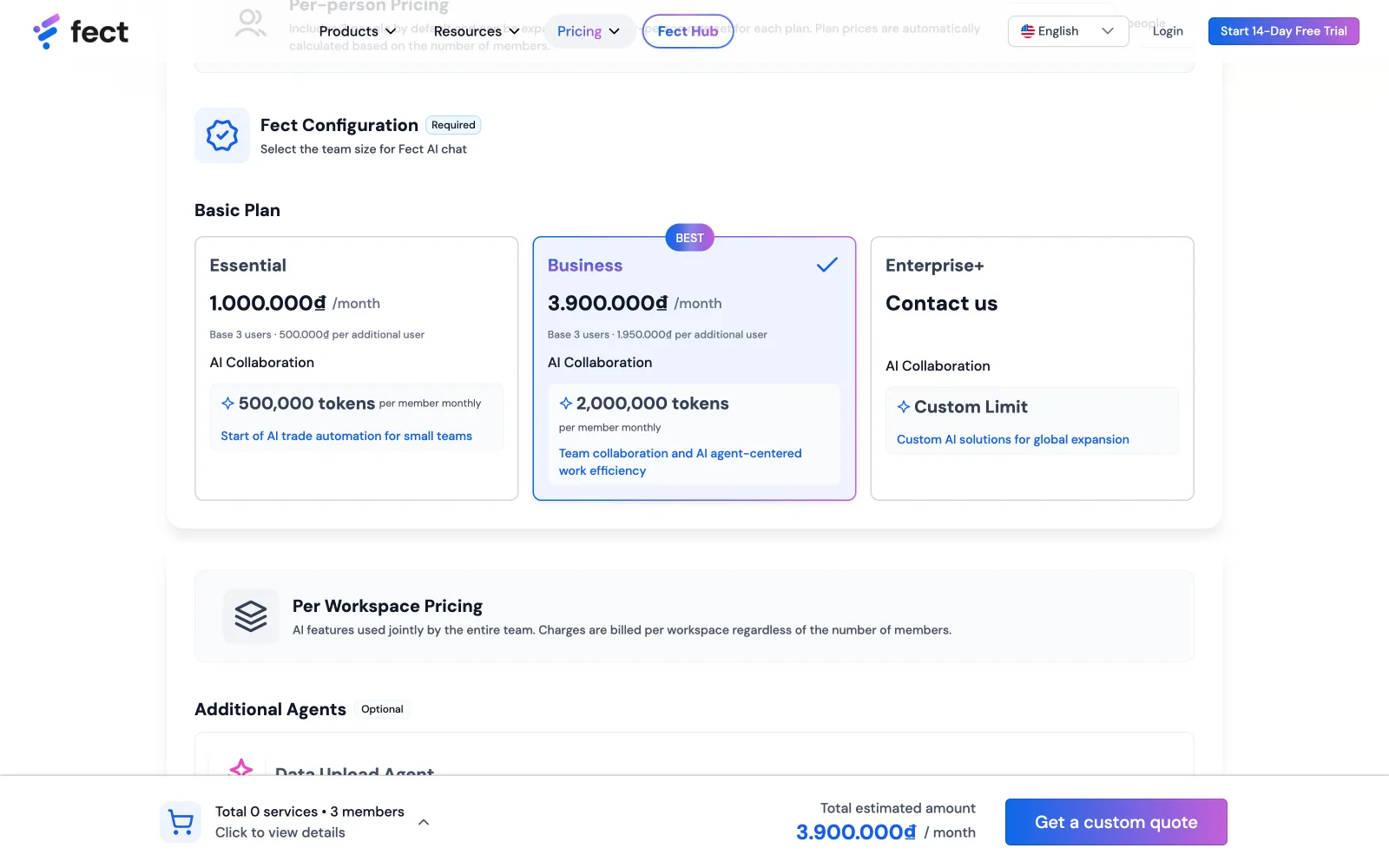
Three plans priced in VND with token quotas is a spreadsheet in disguise, so the page carries a live calculator: add seats and the total updates in place, toggle annual payment and the −20% applies before your eyes, while a sticky cart bar keeps the running total in view through the whole scroll. Nobody emails 'how much for 5 people?', the page already answered.
A sub-brand that teaches before it sells
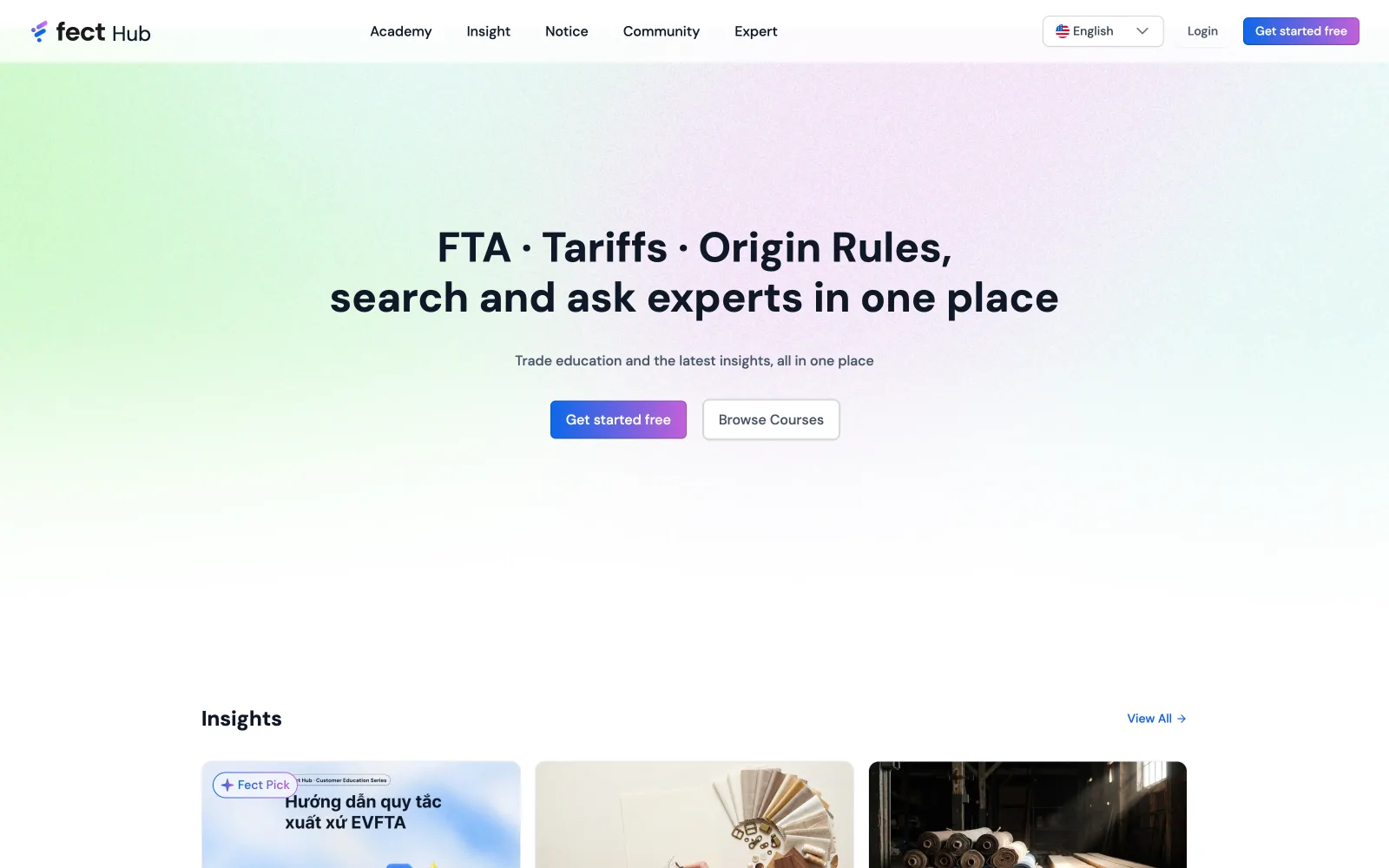
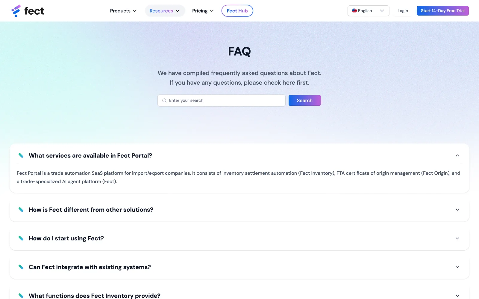
Trade compliance is a trust business, so the portal grew an education wing: Fect Hub, with its own gradient identity, teaching FTA, tariffs and origin rules for free. Design-wise it had to feel related but distinct (same type system, a warmer palette) so a reader always knows whether they're learning or buying. The hub feeds the funnel the honest way: by being genuinely useful first.
Designed to speak English and 한국어
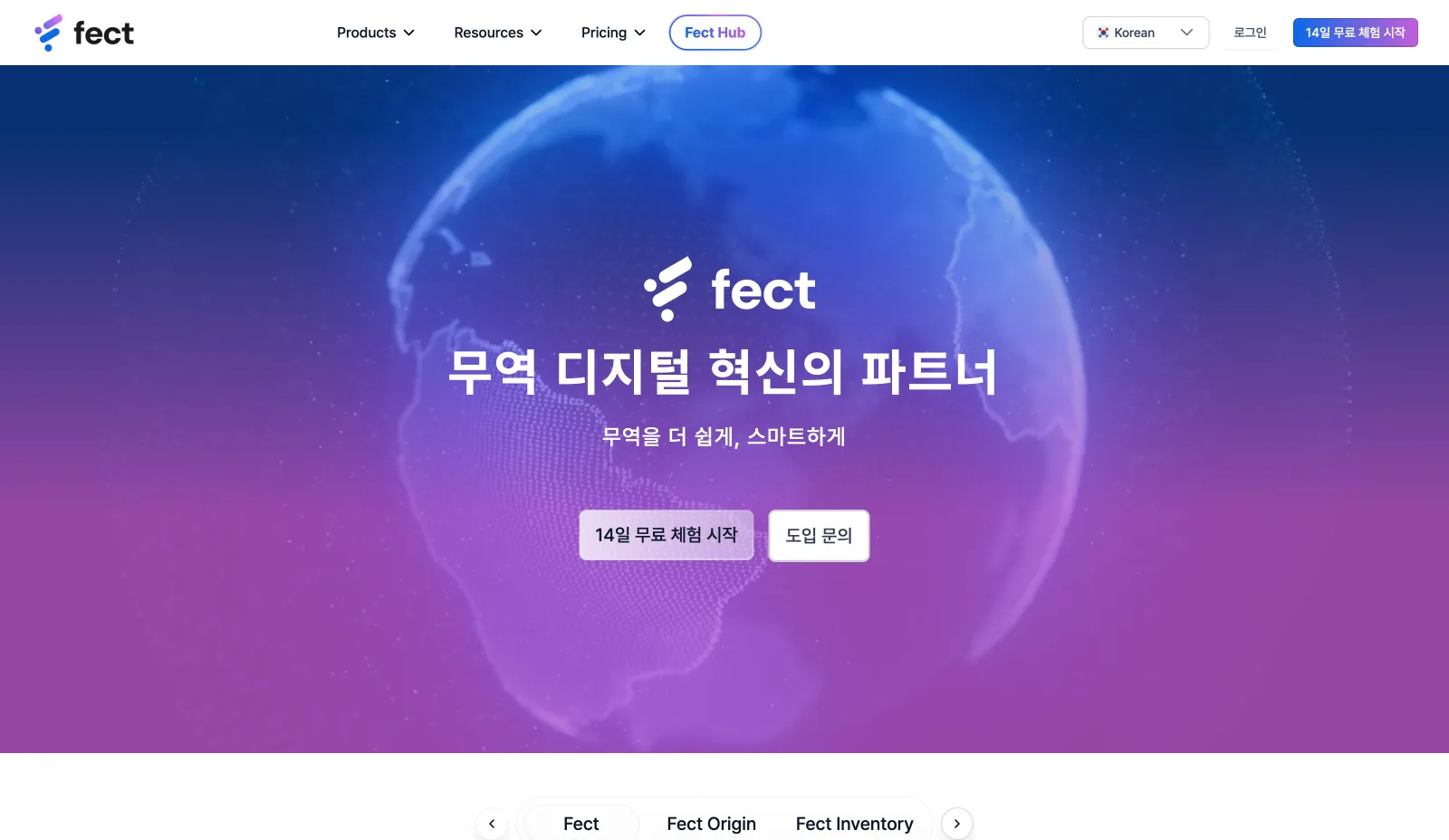
Korean trade teams and international partners read the same portal in different scripts, so the layout was designed to survive both: Hangul runs denser and breaks in different places, headline rhythm changes, buttons grow. Drag the divider, the hierarchy holds in either language.
Landing hero · drag the divider
Recognition first. Features later.
Treat the board as users, too
The endless approval loop was really a research gap. I studied the Korean board's design culture and a dozen Korean sites, found the shared aesthetic (vibrant, dynamic, youthful) and designed toward it, turning subjective debate into alignment.
Two design systems, on purpose
The product design system didn't fit a vibrant marketing landing, so I spun up a second, simplified system for the landing: keeping product consistency while meeting the board's aesthetic, fast.
Skip hi-fi wireframes
With four weeks and no content, I prototyped straight on the design system instead of wireframing: running design and CEO-supplied content in parallel to hit the deadline.
One UI, switchable real / demo data
Missing real assets could have blocked the build. A switchable real/demo mode with an identical interface let the page ship now and swap in real content later.
Ship hero motion now, hire a specialist for v2
With no motion designer and a hard deadline, I spec'd the animations myself and agreed with the board to keep the hero motion as-is, while advocating to bring in a dedicated motion designer for the next release.
 01 / 0702 / 07
 03 / 07
 04 / 07
 05 / 07
 06 / 07
 07 / 07
- ✦Document completion rate 68% → 90%
- ✦Customer activation 12 days → 4 days; CSAT 7.2 → 8.9
- ✦Support tickets −40% (~$20K/yr saved) via in-app guidance
- ✦Design system cut development time ~30% and lifted UI consistency 6.2 → 8.8
- ✦The products I design now generate $500K+ ARR across 4 core systems
The biggest lesson wasn't visual. It was that stakeholders are users too. Researching the board's design culture turned an endless approval loop into alignment. And with no product, marketing or motion role in place, I had to stretch across all of them without dropping the thread, the breadth I think a modern product designer should have.